Towards the end of the third quarter, MCPS students, teachers and parents alike were caught off guard by a sudden overhaul in Synergy, the system that serves as the center for students’ most important information, such as grades, course registration and attendance. The immediate reaction from most Synergy users was overwhelming disdain for the slew of unnecessary changes that made the system exceedingly complicated.
Students’ primary complaint seems to be over the new user interfaces, both in the gradebook and on the homescreen. In the gradebook, assignments are now sorted from least to most recent, forcing students to scroll through a long page to see the test score they have been waiting for. The new layout also has significantly more clutter, from a giant search bar in the middle of the screen to a week-by-week outline, which makes the essential features harder to find and the entire page as a whole disorienting to look at.
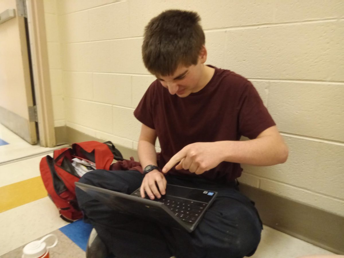
“I liked the original gradebook format, and now I have to click another button to get to the original format, which is inconvenient,” WCHS freshman Miriam Clopper said.
Another point of visual controversy is in the new StudentVUE homepage, where instead of defaulting to the service’s built-in inbox, the updated system will bring students to a page select screen with large icons. Although some complain the extra page serves no purpose and is visually unappealing, others say it makes navigation easier.
“Personally, I like the bigger buttons because they’re easier to hit on touchscreen,” Clopper said. “But I get that some kids think it’s not needed.”
Yet whatever subjective opinions students hold over the new homescreen, there is at least one comical oversight: not even all the giant buttons work. Granted, users of StudentVUE will rarely use most of the buttons– but surely a company promising a premium product would be able to deliver functioning tools.
“The myMCPS Classroom button doesn’t even function which is incredibly inconvenient for anyone who wants to enter myMCPS Classroom through Synergy,” WCHS junior Bradley Levinson said.
On the other end of the spectrum, teachers have their own gripes with the Synergy update. It is often overlooked that teachers spend considerably more time on Synergy than students, with taking attendance, grading and everything in between. Some of these teachers feel inconvenienced by the shift in processes they have already gotten used to.
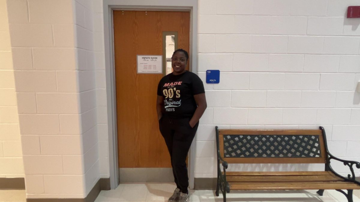
“They changed the way we take attendance,” WCHS English teacher Kelly Knarr said. “It’s just a totally different way to take attendance and it’s really frustrating.”
As with the student end, the Synergy update appears to have added numerous new icons, buttons and other elements to the teacher’s user interface that add clutter and seem mostly unnecessary.
“There’s too many buttons, too many things… there’s this button for new students… why do I even need that there?” Knarr said.
Another regular criticism seems to be that the Synergy update was timed particularly poorly. Granted, as this was likely an Edupoint-set date, there wasn’t much MCPS or WCHS could have done to shift the launch, but even that does not invalidate the broadest question: why launch the update in the middle of the year?
“From a parent’s perspective, they updated the system the same day summer school registration opened,” Knarr said. “It just seems like mid-year is an unhelpful or unnecessary time to change everything.”
It also seems that the dizzyingly sudden change in many of Synergy’s systems could have been at least somewhat mitigated had communication between MCPS/WCHS and teachers, parents or students been more effective. All Synergy users were largely caught off-guard by the sudden change, and had to quickly adjust to new ways to check grades, take attendance, register for summer courses and more.
“They did not communicate [the update] to staff, and if they did, it was buried in emails,” Knarr said.
Looking towards the future, some speculate that the angry buzz around modern-day Synergy will die down as people get accustomed to it. After all, for all the complaints, Synergy does include some new positive features, such as a back button that makes traversing the site easier and a built-in grade calculator. Additionally, teachers and students who dislike the new system only have to hit a button or two to return Synergy to its pre-update look– temporarily.
“It’s not better, and it’s not worse,” Levinson said. “It’s just different.”
Ultimately, this update will be nothing worse than an inconvenience, and nothing better than a helpful tool. However, all the irritation surrounding new Synergy is understandable, given how functional the previous version had been.
“I guess my question is: ‘Why was there a need to change it?’” Knarr said.
